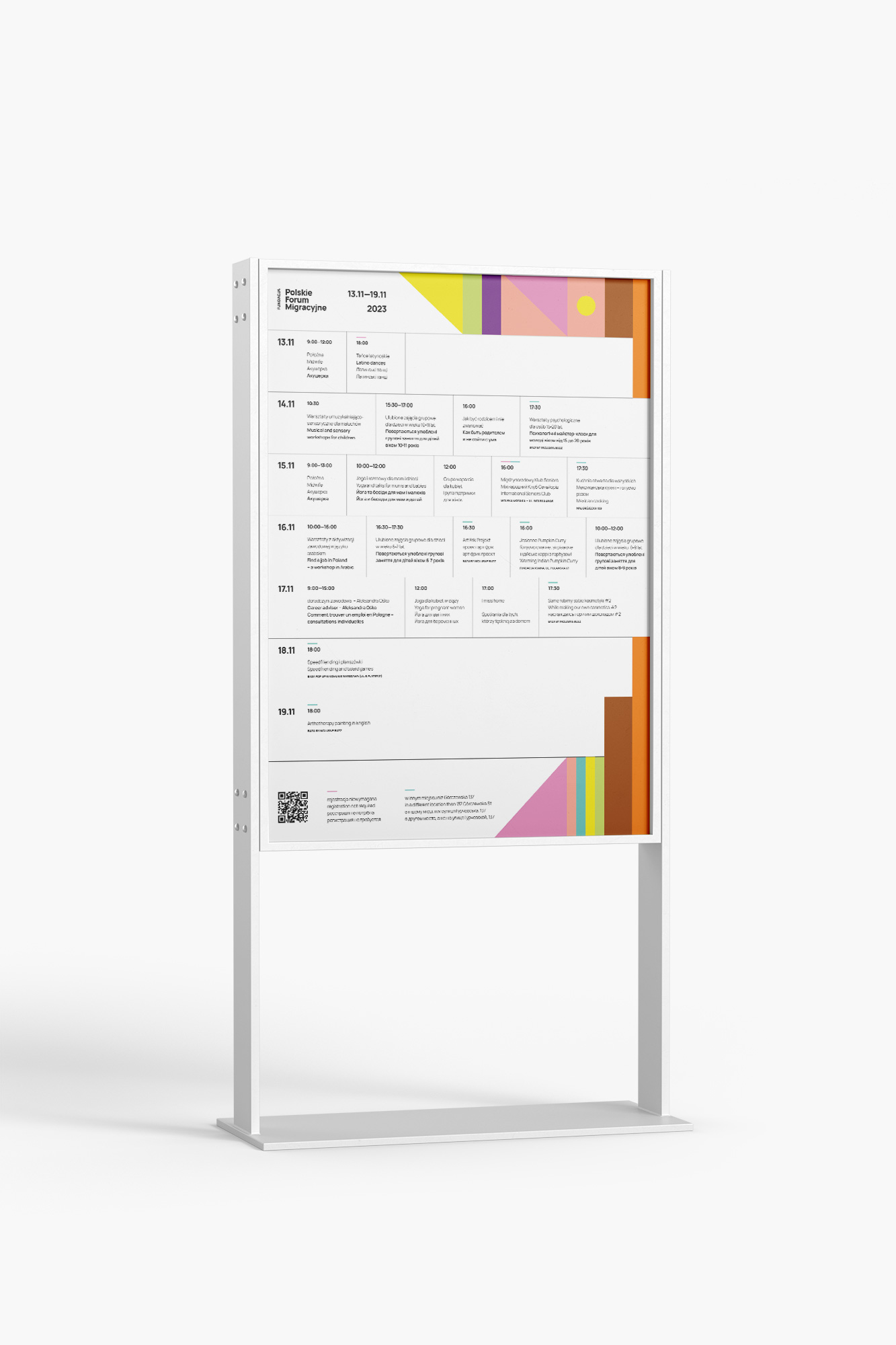
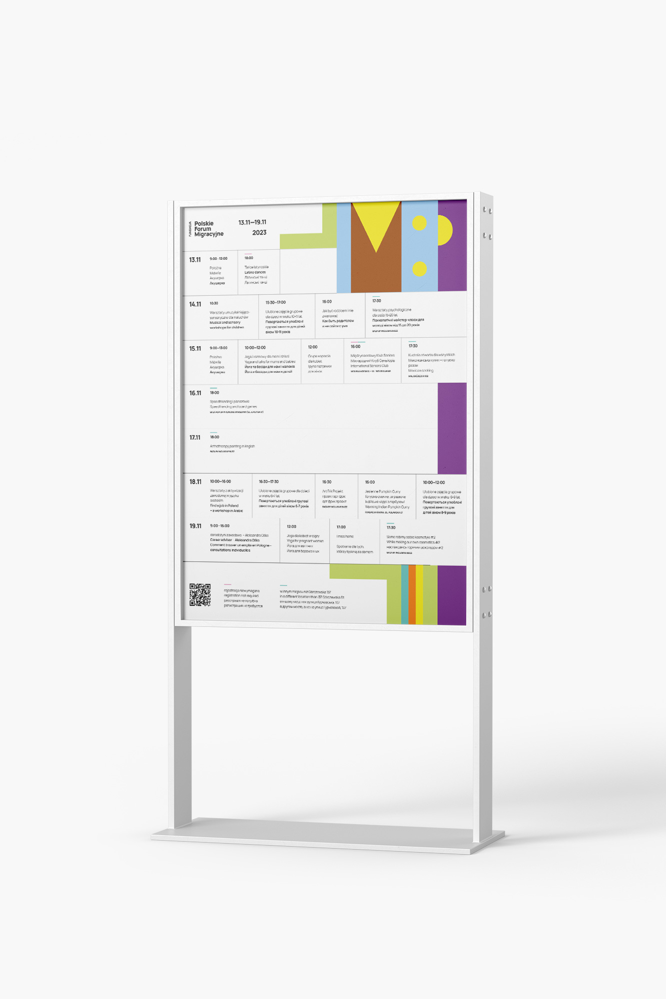
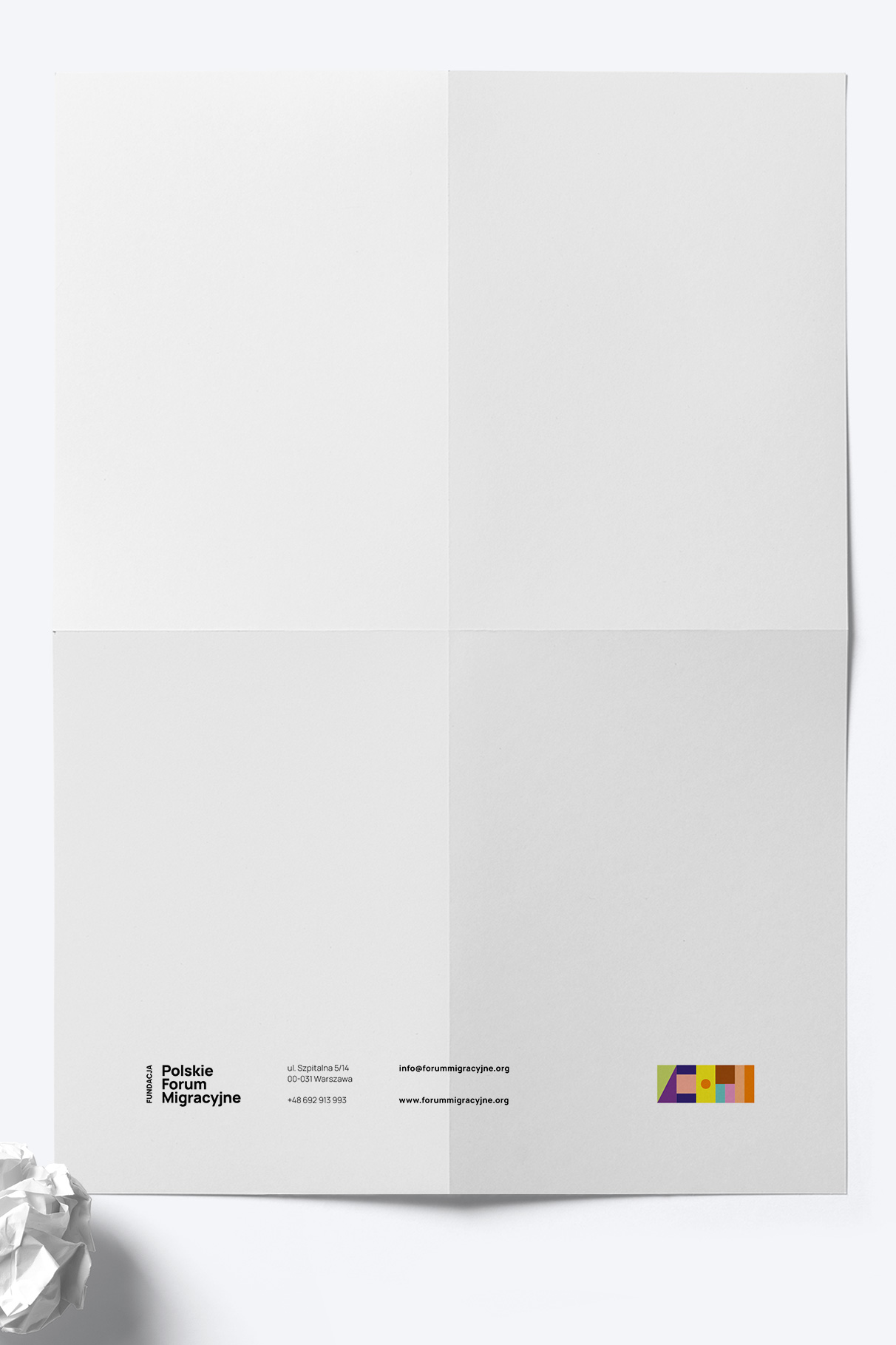
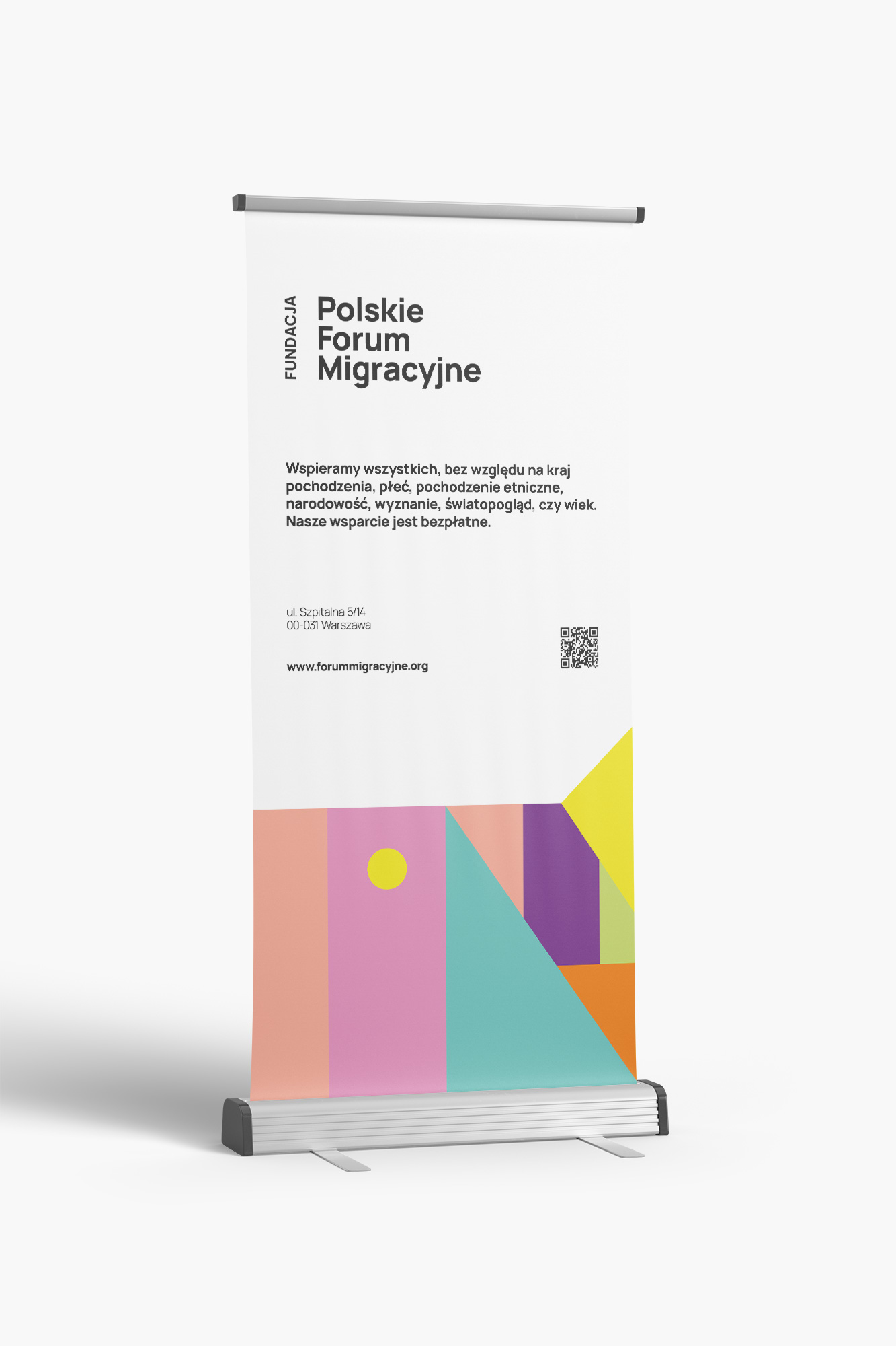
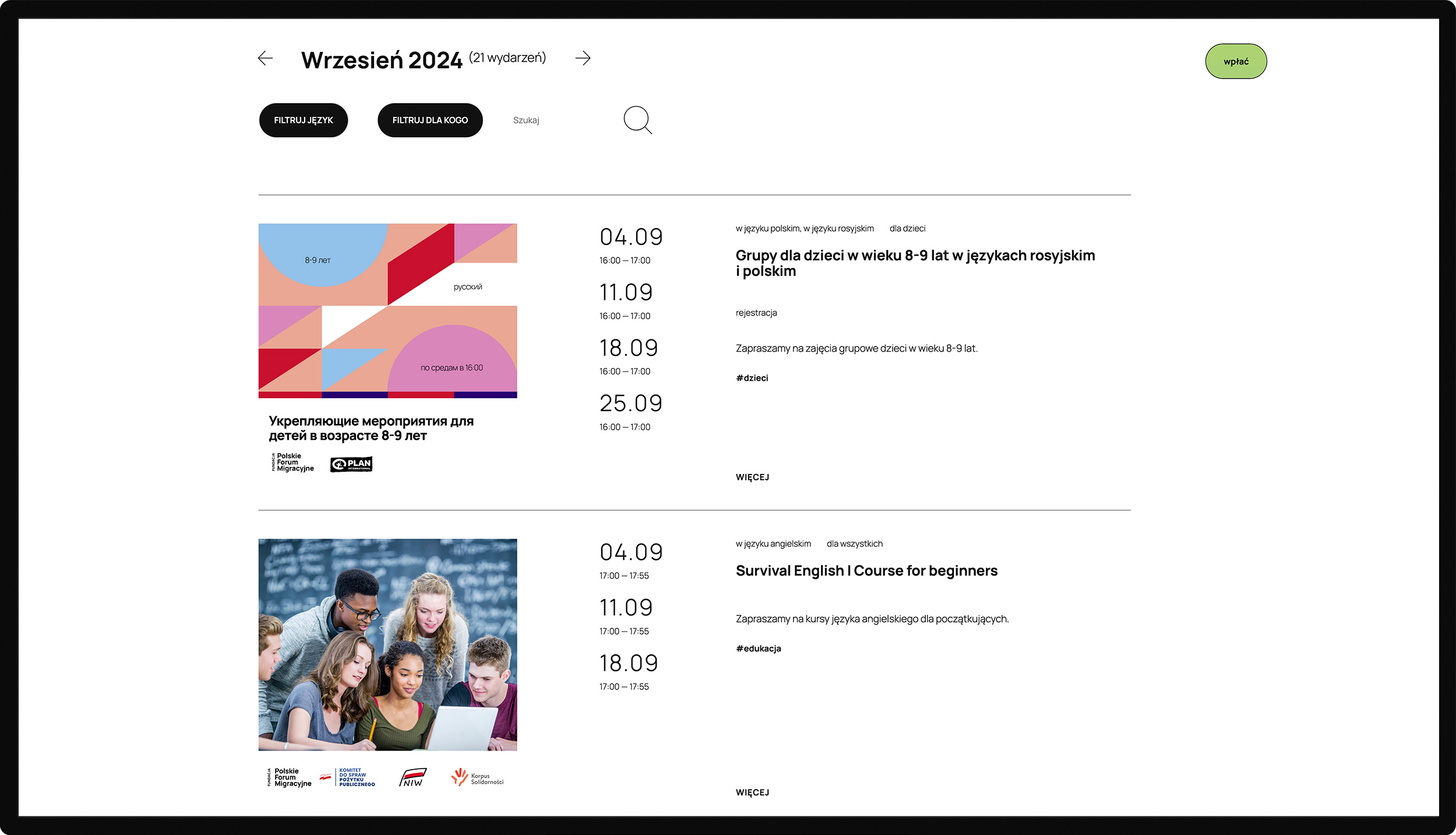
Polskie Forum Migracyjne
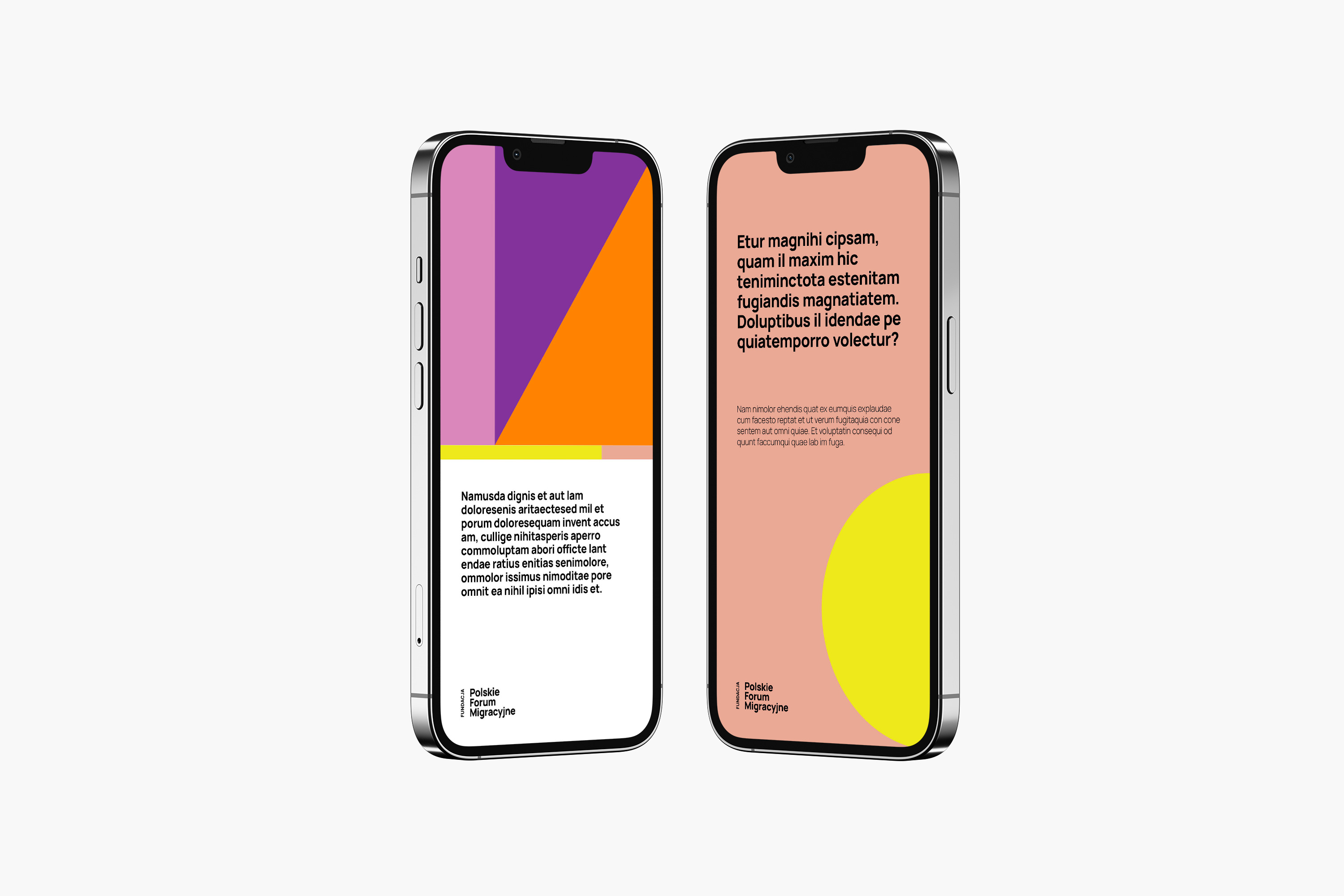
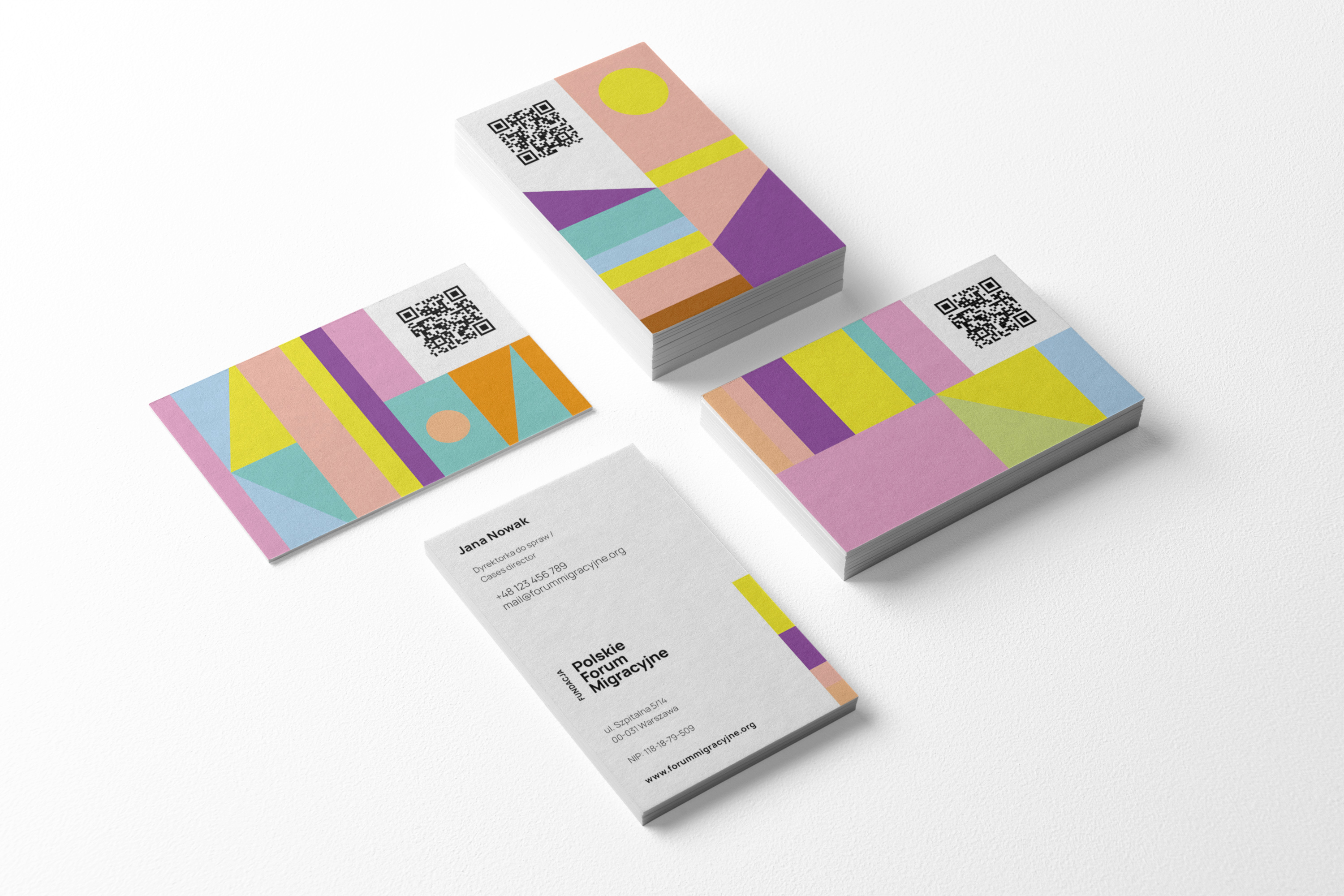
“What the Foundation does on a daily basis is an exchange: of thoughts, stories, experiences, recipes or ideas about life. Every day we feel enriched by the diversity that surrounds us and we wanted to reflect this diversity in our identity. Hence the decision not to be represented by one leading colour, but to make our identity colourful. So that we are not represented by one chosen shape, but by a multiplicity of them. So that it is the very variability and interconnectedness of the various elements that become our symbol.
The juxtaposition of simple geometric shapes, each of which can take on one of twelve colours, creates an infinite number of combinations and we look forward to being able to redefine ourselves with each new design for a report, flyer or social media post.
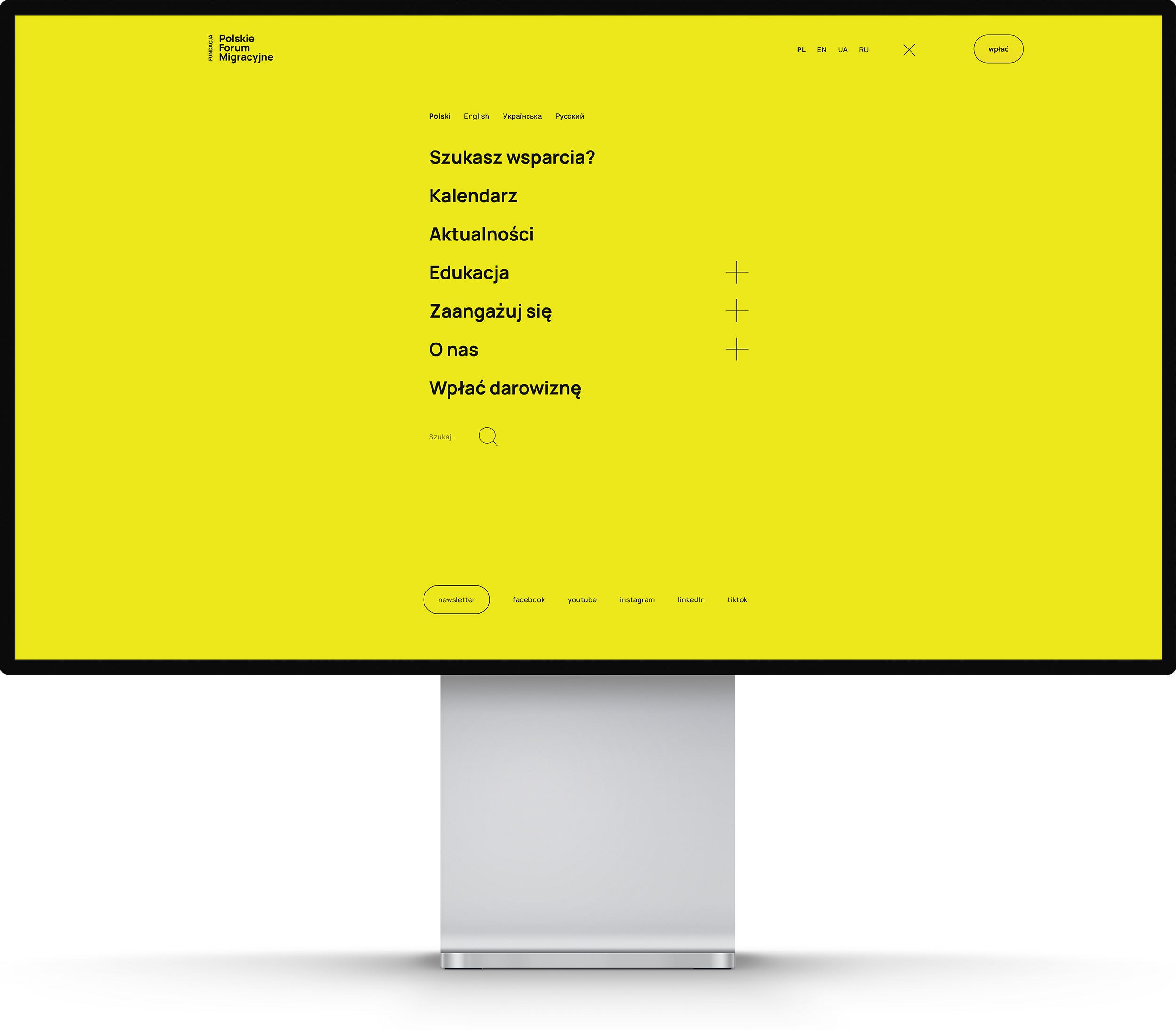
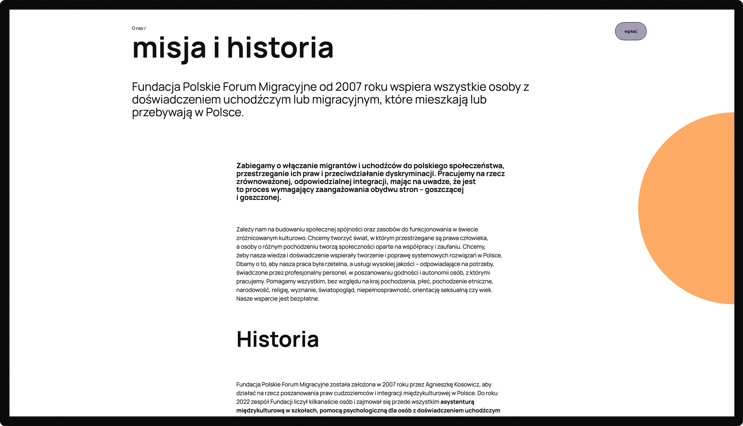
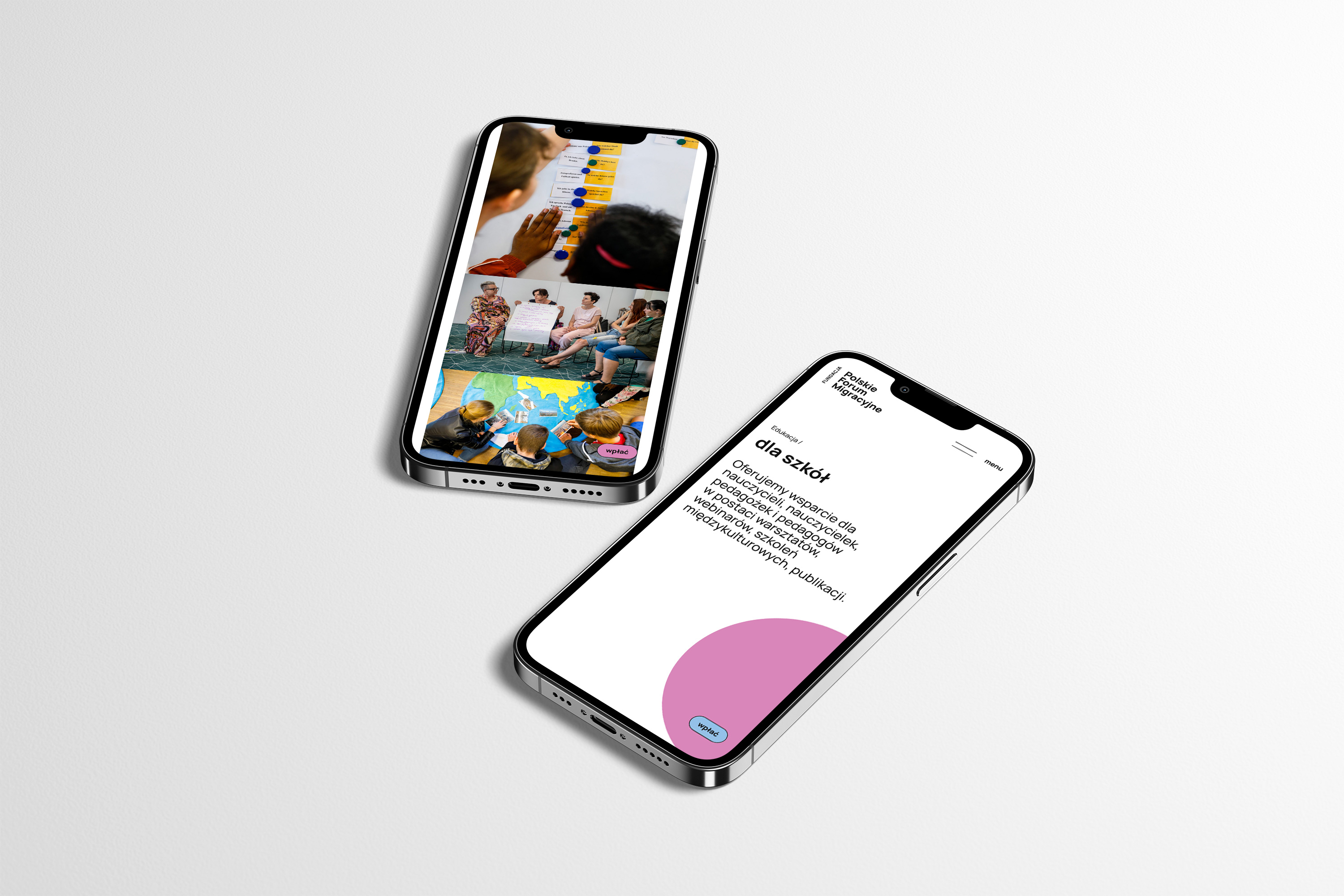
Transparency, clarity of messages and ease of finding information are also very important to us, so it is on these qualities that our new website as well as the entire identity focuses”.
Rebranding, website (coded by Łukasz Grochowski), social media communication layouts and promotional materials tamplates for an NGO that does a lot of good.